home

Saturday, 19 April 2014

Corrugated metal

so awhile back i created this tag
and thought how great would this look on large scale.  So i ordered 24"x12" cardstock and started folding, alot of folding
but it was worth it


 i folded cardstock into corrugated paper then painted with distress paint to look like eroded metal.

once i prep the canvas (cheese cloth and gesso) added the old gas pump image transfer.  My color printer prints up to 12"x19" and since i ordered large cardstock i don't have to print as many panels which makes piecing the image back together much easy.


 once corrugated cardstock is painted and dry i ripped and added to canvas to frame the gas pumps.  i glued on the corrugated but also added metal brads for another dimension.  from there the rest was easy, added espresso brown to exposed canvas and blended into corrugated and image transfer.  Added highlights of rusted metal metallic paint and black around the edges.


highlighted the words by dry brushing white over the letters.  wanted them to be visible but not to bright or they would overtake the canvas

look how you also get shadows created from the corrugated cardstock since i didn't attach edges again another dimension.

TEXTURE AND DIMENSION- my goal with every canvas.

Wednesday, 16 April 2014

layering chipboard

i have had an idea a couple of years ago for chipboard with intricate design and layers to add dimension, then when i started experimenting with distress paint the idea took root again.  I have always loved chipboard but distress ink soaked in too much and you didn't get a true color, arcylic paint was to thick and so on.  BUT! distress paint was perfect- holds it color and is thin and easy to apply to chipboard and paint intricate designs.  So a couple of months ago i started turning my ideas into designs, finally i can get chipboard designs that i haven't been able to find- by that i mean steampunk and vintage!!!!

 I painted the base layer with peacock distress ink, and the top two pieces with white distress ink.  It takes a couple coats of white to get a white white not a gray white.


On the base layer there are score lines to separate between pump, hose and gas pump body.  Use the score lines as guides to paint details of design.  Here the base is peacock, barn red for pump with accents of silver, and black for the hose.  Once dry, sand and ink with vintage photo distress ink.  The distress paint resists distress ink so it only colors where distress paint has been sanded off.  I wipe off with a wet paper towel to remove excess distress ink sitting on the top of distress paint.  The finished look has a super cool vintage feel.


the details for the sale is super small so i used a fine point black maker, plus since they are sanded and inked it doesn't need to be perfect


sanded and inked


 top of gas pump painted within score lines
sand and inked
the more you sand the more distressed and antiqued it looks.


finished gas pump assembled.  Detail and Dimension LOVE LOVE.


Monday, 31 March 2014

an oldie but a goodie

This is one of the first layouts i ever did at the first crop that i ever went to.  The picture was before digital so you didn't know what you got til you developed the film. When i was 20 years old i went to London, England on a college trip for "culture"  and ADVENTURE! Techinally we were there to see museum and view store window display.  I would recommend the V&A, Wax Museum, London Dungeons and Hampton Court Palace (a train ride outside of London), of course this was 15 years ago things may have changed.

Here is a photo of a window display that i then recreated on the layout.
you can't see the picture very good, the store window has Spring Greens and peacocks in, so i used the same idea on the layout.


 i recreated the peacock feathers with embroidery thread, started in the middle and wrapped around and in the nooks.  The only problem was how messy my fingers got.
final touches for the long feather was a swirly stamp.

I might have to revisit this technique.

Tuesday, 4 March 2014

its all coming together

i have been working on a new project and it has me super excited!!  I designed and had custom chipboard cut, the designs of the chipboard are meant to be painted and layered.  The chipboard is quite intricate so i used the Tim Holtz distress paints to paint the details.  Once painted and dry i sand and ink and it looks quite vintage like.  Here are a few sneak peeks.

 the front is a box about 1" thick that i have layered with chipboard and paper
 side view showing the depth of the cover, the hanging lights are made with domes from Tim Holtz, wire inserted into the cork
i used crumbled up a kraft paper bag to insert in between top and bottom- added interest and texture
 my favorite of custom designs - vintage eye glasses the eye docotor use to use.  My first eye doctor was super old and this is what he used, i loved going to the eye doctor, i was go intrigued by the glasses and interchanging lens.
vintage camera- painted the different elements with a paint brush and used epoxy in lens center to make it look more realistic
not sure what this is called but here i painted the outer ring with antique white then once dried painted with stormy sky , when i sanded the antique white was visible underneath- another layer of dimension


 a layered compass, again painted the details with a paint brush and distress paint
another favorite, hot air balloon this one has super fine chipboard parts but the end result is FANTASTIC


I haven't quite figured out how to bind the album with the cover but i will come up with it.  This will be a digital instruction kit for sure but not sure if it will be a physical kit.  i will keep you informed.

Friday, 28 February 2014

What's up!

I went in to view my blog activity today and realized I haven't posted in two weeks, I don't even know where the two weeks went!  Right now I am in the middle of about three projects plus computer work so to say the least nothing much is actually getting down.  Unfortunely I will be returning to work on Monday after 6 weeks off and my crafting time will seriously be cut, wishing ny doctor gave me the whole 8 weeks off.
Not sure what will win this weekend housework or crafting?

Friday, 7 February 2014

Texture Journal

Just finished a new kit- Texture Journal!  This one for me was all about creating textures on the page layout.  I used papers by Kaiser Craft Basecoat, 7 dots and Prima Marketing that were already full of texture, then i added more!!!  It is a 5 page album with 6- 8.5"x11" layout (pictures and instructions for layout included), 6 blank pages and 15 pull tags for everything else- additional pictures, journaling, then it is all bundled up into vintage inspired book.  HERE ARE THE PICS

Instructions available at Etsy for $10

The kit will be available at Treasured Memories http://www.treasuredmemories.typepad.com/
next week (I need to drive to Edmonton to drop off). 
The kit includes paper, embellishment, instructions and pictures.  $115


Tuesday, 4 February 2014

Observations


 I used distress paint to create this tag- and i am offically addicted!!!  I love paint the chipboard , I can also mix the paint with molding paste and it still holds it bright brillant color.
So i used Crushed olive, pumice stone, wild honey, evergreen bourgh and dusty concord.

i painted the brick chipboard with crushed olive and wild honey, allow to dry


i mixed molding paste with pumice stone distress paint . I applied the molding paste to the tag using a palette knife
 next layered the dry painted bricks on to the molding paste, leaving the center of the tag empty.  I love of the look of molding paste pushed up between the bricks- looks just like an actual brick wall

 finished the brick all along the outside and top and bottom, allow to dry- this takes quite awhile
trim the bricks the tag edges, i then sanded the bricks and inked with distress ink- pumice stone.  Again LOVE the effect this created.  I also inked the inside of the tag with pumice stone where there is no brick
 then i flipped over and inked the back of the tag
 i punched out the inside of the tag then inked front and back of rip with walnut ink


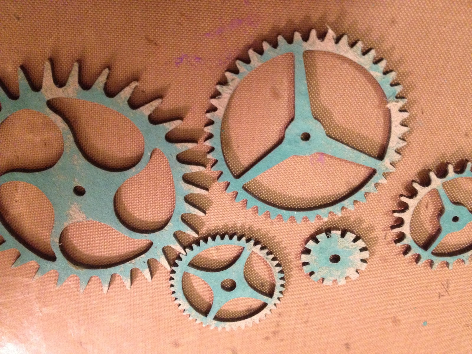
i painted the gears with evergreen bourgh, allowed to dry and sanded


 I layered the gears behind and in front of rip-  added the painted chevron to the front
finished tag- i added painted chipboard filmstrip in the background.

Now i am out of brick chipboard so i am going to have to buy some more because i need to do this again!

THIS IS MY FAVORITE- until the next one!