home

Saturday 31 December 2016

Classic VS Urban Decay

This double page layout ( I rarely do double page layouts was never by favorite thing but I had to many pieces for a one page spread would have been a clustered mess).  I want to mix classic patterns- floral, muted tones and intricate doilies with urban decay patterns- starburst, checkered, bold bright colors.

I started by applying checkered pattern with light modeling paste through a stencil.  I really like light modeling paste it dries quicker than the regular and i think i get cleaner lines, the regular stuff tends to bleed underneath.  Maybe its just me.
Here's how i like to add color, I splatter liquid color around stencil, then...


spray with water, I like that i can control where the color goes easier.  I also like to add modeling paste first since the color pools in and around edges.


Repeat steps with next color.


Next i splattered with watered down white acrylic paint, then painted checkers with black acrylic paint.  I paint after all the color is added around checkers so the black stays nice and crisp.

Repeat steps with second page.


I cut up chipboard pieces and lightly covered with some modeling paste to give it a more dimensional feel. Completely dry. Paint with acrylic paint. Once everything is dried i lightly inked with a darker color, the ink sticks to the high points created with modeling paste.

I ripped up some cardboard and lightly painted with gesso paint. Next add some mini art stones onto cardboard with gel medium. Completely dry.

Next add some color

Its really cool how the color settles into the grooves of the mini art stones.


Put it all together and here's what you get.  Before i added the layers i added more texture with stencils and ink.
Page 1

page 2

Once everything is layered together splatter on some white paint.


 All the close ups- always my favorite pictures.

Happy New Year, we will be celebrating tonight with Harry Potter.


Thursday 29 December 2016

Merry & Bright

This week i tried my hand at coloring an angel, for the Merry & Bright at 
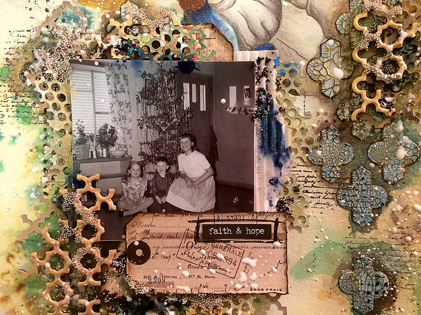
The Mixed Media Monthly Challenge. The Christmas pic is an old black and white of my mom and two of her siblings, she is the one on the left side crossed legged on the floor.

I started with watercolor paper that i did a light color wash with my water soluble wax pastels.  Next I found a old vintage print of an angel and drew her onto the top of the page then colored.

Next added some doilys onto page, used a stencil and distress ink.  I wish I used a permanent ink once I started adding more color the distress ink blurred.  Next applied white crackle paste through a stencil, added color around stencil with Lindy's Creme Burle Cream.  At this point is very light color which i like very much I added to much color later on.

Added more color.


I wanted to highlight the stencil pattern, so
Step 1- Used a paint brush and ground espresso distress ink to darken around pattern
Step 2- Sharpen a black water color pencil dip point into water and outline around pattern.  Needs to be super sharp and you will need to continually dip in water.
Step 3- Use a baby wipe to wipe off excess color on pattern
Step 4- Paint pattern with blue acrylic paint, then add a light coat of gold acrylic paint
Step 5- Lightly rub a brown water color pencil on cracks of pattern.  This will highlight the cracks

Phew you tired?

Here's how it looks.  Now here is where i think i added to much color, I wanted it to be a lighter page, thought it would look more angelical you know since there is an angel and all.


Finished layout with photo cluster.  I used tags, chipboard wallpaper texture, microbeads, corrugated cardboard, and cardstock texture.

Before the cluster went down sprinkled Stampendous shabby white embossing powder on page heat from the bottom to set.  Next randomly stamp with texture stamps and black archival ink.

To add the micro beads randomly paint on gel medium while it is still wet sprinkle with micro beads.  To finish add journal statement and splatter white gesso on clusters.


Now for the close ups- I love the close ups, I always like my pages more in the close ups lol.  I really think the photo cluster would pop more if the background was lighter.  Next time that is the goal.

I am now up to 48 followers almost made my 50 follower mark by the end of the year.  Thanks everyone.


Wednesday 21 December 2016

Traditions and Handmade

Trying out a new challenge blog More than Words, this month challenge is Traditions and Handmade

I tried another page with a bird drawing, I don't fully love this one, and it was a fight from beginning to end.  Why is it some layouts just flow then the next is a struggle.  When it is a struggle I can't leave it alone.  I know you should take a moment but i just keep going in the hopes that it finally clicks.  No turtorial today, I am tired my silly dog keeps getting up in the middle of the night I need 8 hours straight no interruptions.  The night Alex finally slept through the night was the best night.  What was i thinking a puppy????

I started with creating a watercolor background then drew and colored a bird on top- this is the handmade portion, made my own paper.
Tradition- Every Christmas when we were little we would going tree hunting.  My dad, sister and I would get all bundled up and hunt for the perfect tree, first my dad would drive and drive, then we would trudge through the snow (calf deep snow).  My sister and I would suggest trees, Dad would always say no we can do better, then we would usually cut down the first one we saw LOL.  Now my sister and I continue this tradition with our children and spouses.  And you know what i also looked at bunch then picked the first one we saw.


The close ups
I love how tangled threads looks adds movement but it not heavy and clunky or solid you can still see through.  Very organic.
 Underneath these layers is a birdcage with layer after layer of media until i finally got what i was looking for.  First embossed with stampendous ochre embossing emamel, then added umber paint on top and wiped off excess- diluted enamel color. While the paint was still wet i sprinkled on black micro beads, next covered birdcage in glossy accents.  layers layers and more layers
 My favorite portion-mixed modeling paste with rust mica powder applied through a stencil then added color with Lindy's and a paint brush around stencil.  To get the Paris to really pop I applied glossy accents on top once dry it looks all bright and shiny and much easier to see.


Love the circle mesh bits cut from cardstock with my silhouette, I usually add to all my layouts.

Thanks everyone I have tons of blog views this last week and have two more followers.  Whoo Hoo

Merry Christmas Everyone, have a fantastic holiday.

Saturday 17 December 2016

Winter Wonderland

So for this challenge Winter Wonderland at Mixed Media World i continued with drawing onto a background and coloring with my prismacolor pencil crayons- my new tool obsession.  It started here

I sprayed onto watercolor paper with Maya Mister Huey's and water, just wanted very loose watercolor paint effect.  Next i found an image i like on the net and drew it onto the page.  Color with prismacolor pencil crayons.  These pencil crayons blend beautifully.  Now at this point i debated if i was going to leave as a drawing or create a page.

I added more.  Started with adding a texture with modeling paste and harlequin stencil.  Next painted with Lindy's Whale Watch Blue.

Next add another layer of texture by inking with iced spruce distress ink through a flowered stencil. Then randomly stamp with black archival ink and texture stamps around harlequin pattern.
Now several new layers.  First sprinkle Stampendous aged ivory embossing enamel on/ around harlequin pattern.  Heat from bottom- I like to do this so i don't need to use a embossing ink. Next splatter with Lindy's Whale Watch Blue, then while it is still wet spritz with water- it will slightly blur like water splashing onto a flat surface.  Repeat this step with Lindy's Golden Doubloons.  Outline around harlequin pattern with a black pen.


Rip up some cardboard, expose some corrugated liner.  Paint with white gesso, then spread translucent crackle glaze on cardboard.  Allow to dry completely.


Paint cardboard with a combination of Lindy's Whale Watch Blue, Lindy's Clam Bake Beige, and Prima Green Opal Magic mica powder mixed with water.  To define the crack more I slightly wet the tip of a brown water color pencil and colored cracks.  I rubbed in with my fingertip then wipe off the excess from top.  I have been reading Scraps of Elegance Blog by Joyce Kers, this is where i read about this technique.  This blog is fantastic for ideas and inspiration.

Next add microbeads into corrugated layer- use gel medium to glue on it dries clear.  Don't they look magical?  Not pictured here- i inked the outside edges with ground espresso distress ink.

Next i painted texture chipboard with white gesso and while it was still damp sprayed with Mister Huey's Manila color mist, now while that is still wet sprinkle with clear embossing powder.  Heat set embossing powder.
I don't have a picture of it but i rubbed alchemy paint opal magic rose gold paint along top- gives it a nice pearlized shimmer.


Here are the elements pulled together.  I cut out stars from cardstock and colored with Lindy's Clam Bake Beige and Golden Doubloons.  Add my favorite circle mesh texture bits behind cardboard. The picture is from my mom's family photos I love old black and white photos.  I wanted to added a little shimmer and lighten up the circle mesh bits so I lightly painted with Prima green opal magic mica powder with water.  Finally (yes one last step) spatter photo cluster with water down acrylic paint. I like to water down the its splatters easier.


Next the close ups.
This was a fun project, love the final look a mix of grunge/ distress, fine art and sparkle.