home

Sunday, 29 January 2017

This one is for Mrs. Davidson

Today i completed a page for Mixed Media & Art January challenge, here is the mood board,

Now when i look at this mood board i see purple, leaves and nature.
All this made me think of "purple trees" When I was in grade 12 I had the most amazing english teacher- Mrs. Davidson.  She inspired me to read and think/ dissect what I read.  She once told us a story, two girls opposite in personality and nature.  They knew each other as small children but didn't meet again til teenagers in grade 12.  The one girl, the out of the box thinker, flamboyant one looked at the other girl, the organized straight laced one and said you told me not to paint by trees purple.  I think this describes the world those who see what is and those who see what could be.  Neither way right actually both are needed for a balance.

Left Side

The right side

Full pages together, same on both side just a reflection of each other.


I started with a blank page, adhered old book pages with gel medium then scraped on a thin coat of gesso.  Some random stamping, then layer paper blocks on in center.  I added some harlequin pattern along top and bottom and edges of paper blocks (not in picture)

I added Lindy's color- starburst Jazzy Jivin Purple and moon shadow Moonlit Mulberry.  I started with Moonlit Mulberry, puddled a large amount on then used a brush to move around page to make a tree.  I also sprayed with water so edges fan out.  It already looks like a tree.

Now for the little details,
I outlined the paper blocks with charcoal then smeared with my finger.  I highlighted the harlequin with gold acrylic paint just lightly brush the paint on.  Outline harlequin with white gel pen.  I drew on details to the tree- trunk, leaves, and roots.


Next i painted on embossing ink (used my emboss it dabber) and sprinkled on stampendous shabby white embossing enamel I wanted it look like frost.  Next i embossed the entire tree with clear embossing powder.  I wanted the tree to be shiny and glossy, subtle change from the background.

Add a little more stamping, phase title, star brad and chipboard postcard edge.


Saturday, 28 January 2017

Monochromatic- 7 Dots Studio

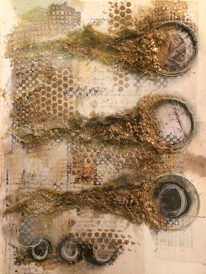
Today i worked on a art journal page for a challenge at 7 Dots Studio a monochromatic color scheme. As usual i started with looking at video and pages that i draw inspiration from.  I have discovered Aga Baraniak she uses wire I knew that i want to do this; incorporate wire.

Here is the inspiration circle.

I started with gluing down old book pages then a thin coat of gesso.  Next add texture in random spots with a texture paste and stencil.


Add some color, I used a combination of Lindy's Flat fabios, starburst clam bake beige, Prima Color Bloom worn leather.  I like to start with splattering the color onto the page, then spray with water to move the color around on page.  Once the page is wet I continue to add color with a paint brush, dry.  I repeat these steps til I am happy.


Added some stamping random.  I used the pre cut circle stickers from 7 Dots Studio- Writer's Block.
Draw around the outside edge with charcoal and smear with my fingertip.  I brought these charcoal stick awhile ago, but I just found them in a very messy drawer.  LOVE THEM.  Its the best thing when you find a lost item.


Next i wrapped wire around a bottle using the end to secure, then stapled around the circles.  I mixed Lindy's steampunk magicals with texture paste and applied more texture with stencil.  Also added some more Writer's Block circles.

Next i added some cheesecloth with gel medium coming out from the circles.  I kind of bunched it all up make it look like it have movement.  Add little puddles of gel medium and sprinkle on art stones and mini stones.

Close up of cheesecloth.

I painted the cheesecloth and art stones with Alchemy steampunk copper, and Prima Color Bloom tea stain.  I painted the copper heavier at the front by circle and less further down.  I sprayed with water to remove sharp edges from paint.


Oh right here you can see i drew around circle texture with a white gel pen.  Just another detail.  I like little details they don't seem like a lot, and half the time they end up getting covered.  BUT all those little details complete the whole page and pull everything together.  There are my words of wisdom for the day.

Here you are the final page, added some splatter with gesso, worn leather color bloom, added an inner circle with pop dots.  The journaling words are also from 7 Dots Studio Writer's Block, these journalling sheets are one of my favorite things from 7 Dots paper pack.

This is an unusual page for me, I usually have a picture. Now i am not a person who says the page spoke to me or i that i went where the page lead me but that is actually what happened.


Tuesday, 24 January 2017

Splash in the Rain

Here is my latest postcard- Splash in the Rain. It uses my seahorse and mushroom stools on Boozybear etsy store.

Products used, alchemy paints rich turquoise, deep waters, gold, black berry and light patina.  Archival brown and black ink, white acrylic paint, modeling paste, Lindy's  dark chocolate truffle, copper micro beads, cream tulle.


I started with a blank 8.5" x 5.5" mixed media cardstock added some twine in the center, painted entire postcard with white gesso.  Once dry added splatter with modeling paste and stencil.
Add color only in center of page over string, I sprayed the color super close to prevent overspray on the rest of the page.  Spray on some water then lift postcard vertical to add drips coming up and down from center color.

Next add puddles of deep waters alchemy paint, spray with water and lift vertically to have color blur and drip. Using a white statz on ink pad swipe across postcard, the white ink will hit the high points highlighting the splatter and string.

Next i cut off the tops of toadstools to look like coral reef. I used 1/4" foam to raise the toadstools and seahorse and painted with alchemy paints.  Used light and darks to highlight and shade chipboard.  I highlighted the cut outs on mushrooms and seahorse with white acrylic paint.


I tucked ripped up tulle behind the coral reef, and in seahorse ribs.  If you quickly zap the tulle with a heat gun it melts and makes it looks more grungy. Added copper micro beads randomly on layout.

Well its Tuesday night and i am wiped, going to lay down and watch some netflix.  I am looking for a new show if anyone has a suggestion.  I love the BBC programing but i have watched all the crime ones and those are my favorite.


Love how the coral reef turned out.


Saturday, 21 January 2017

Under the Sea

So in the continuing story of my postcard creations, here is under the sea again with a steampunk detour.


Love how this turned out, I have been fascinated lately by skeletons here I used cogs, mini cogs and bones chipboard found on my etsy store- BoozyBear


I started with covering the entire 8.5" x 5.5" mix media cardstock with platinum crackle, while the crackle was still wet I arranged the gears in the center in a similar fish shape.  Sprinkle on some mini stones and art stones.  Added a little extra platinum crackle as glue for stones.


How cool is the crackle- this needs to dry overnight so the crackle can do its thing.  Spray with some Lindy's- Lucky Shamrock Green, Gecko Green, Mad Hatter Mix, and Afternoon Delight Denim.  Light in the middle, dark towards the edges.


Paint the gears with rust paste, I wanted the stones to sparkle so i painted those with Alchemy- rusty red and added some Lindy's Delphinium Turquoise.


I mixed gesso with texture powder and covered the bones chipboard.  I wanted the gears to be visible underneath bones so i cut out ever other bone on fish skeleton.


Painted the fish bones with Alchemy rich turquoise, and deep waters.  I highlighted chipboard with steampunk copper, glue onto gears with 3D matte gel.  I just got 3D matt gel and I love it!!!  Good purchase.


I did some random stamping around fish and along edges, inked around edges with distress ground espresso.  I sprinkled shabby white embossing enamel around fish, heat set from underneath.


Here is my favorite part- bubbles, I used water soluble wax pastels colored on in a circle then blended with water- dry.

Once the bubble dried glue on pebble with glossy accents.  To highlight the pebble I drew around with charcoal then smeared with my finger.


Added corners- finished

Love how this turned out.

New designs added to my etsy store