home

Sunday, 7 September 2014

Compendium of Curiosities 3, Challenge 10

here it is challenge 10, just out Studio L3 blog- assemblage clock on page 33 of Compendium of Curiosities Volume 3.  This is my final product, not what i have pictured when i first started this project.  Usually i lend to grungy and masculine, but this turned out to be feminine and soft.

I created a tree with wire that i twisted up for a trunk and bend into branches and roots.  I positioned the tree along the side and bent over and formed the branches into the curve of the clock.
Along the bottom i hide the construction with shaved ice fragments from stampendous, also added small blossoms along bottom.
I ran glue along the branches and covered them with shaved ice as well.


the close up, for the background i used rays layering stencil and color bloom spray- peony.  I added accent glimmer of perfect pearl biscotti spray.  I highlighted the rays with vintage photo distress ink and applied it with a water pen.


I painted the outside of the clock with patina ink- layers and layers of quartz and marine.


I am still not sure if i like the final project but here it is, enjoy!

Wednesday, 3 September 2014

I can see the...laughter

Have you every had that perfect night of scrapping where everything just flows.. that was this layout.  It all started with a sketch from Sketchabilities #122 (blog), as always i like to build a background, lately i have been using a blank piece of vanilla cardstock.
i added harlequin pattern with modeling paste, i re-positioned a 6"x6" stencil several times to cover 2/3 of the page.
 i added color with Prima color blooms and mixed with some water to make drips.  set dry
added some random white gel pen doodling around raised harlequin pattern.


i placed the picture where i planned to glue down, and added some rub ons around photo.  I purposely left off some of the rub ons for a more distressed look.


i added some embossing enamel (aged taupe) in clusters by the rub ons, and heat set the enamel from the bottom so i didn't have to use versa mark.
Once i had heated, i added some glue n seal on top of heated enamel then sprinkled with the same embossing enamel.  Once dry clutters are shiny and textured.


Next!, added some ink.  Used vintage photo distress ink and a blending tool to add streaks of colors over pattern.  I have never tried this before but it is something i will be doing again.  love the final look.


one more step believe it or not, i added detailing over harlequin with hand stitching.  Again i only added the thread detailing in 3 clusters.


the final background.  It turned out so good almost wanted to frame it as is, but the show must go on.


i painted two pack of chipboard gears and rails & wheels with peacock feathers distress paint, allow to dry, sanded and inked with vintage photo distress ink.  I wanted to add some glitz but not hide the color, so next i sprayed with biscotti perfect pearl mist.


I layered the gears, rails and wheels framing the photo, added a few metal gears along the bottom of photo.  Then added a cluster of brads in the top and bottom corners.


Finally the title.  I absolutely love this photo, it is so natural, all of them smiling and laughing, and i love how this layout turned out.  Its not a great picture of the final but my camera is not cooperating.

Enjoy!


Saturday, 30 August 2014

Right now @ this moment

Another challenge completed, Once Upon A... Sketch (blog) supplies a sketch and journal challenge.  This month journal challenge was the men in our lives, and sketch.


And here we go...

I started with a blank vanilla piece of cardstock, added modeling paste with diamond and words stenncils.  Allow to dry.


Used Prima Marketing Color Blooms, to add color.  I sprayed on the color, spritz with some water then move the paper around to allow for drips.  Heat set.


The final background, inked the raised modeling paste and vintage photo distress ink and along the page edges.  Finished the edges with walnut distress ink for darker edges.


 close up of raised background.


glue down the base of page design.  Used my go to love- chipboard.  Used chipboard polaroid frames, chain link frame and @ symbol. (thats an old embellishment found in my stash and then painted black with distress paint.)


add journalling in the form of doddling, added a frame around with brads in corners.


added metal embellishments around picture and frame.


The Final!!!
I like how this one turned out, wasn't sure about the journalling boxes but I think it adds a little egde otherwise I think the layout would be a little too soft looking, a little too girly.


Next to come....


Monday, 25 August 2014

Canadian Scrapbooker

Long time no post- August has been a busy month, first we went camping, then the week after camping is also super busy as you try and catch up at work and home.  The last two weeks of August are occupied with visiting my sister in law and her family from Oregon, since they only come up every 2 years we have been having lots of family time.  I have been really trying to get into my scrap room, but it just hasn't happened. But check out the fall Canadian Scrapbooker, i finally remembered to sent in submissions and they picked two!!!!


Seasonal Gallery Page 129
also used for the cover page and introduction for seasonal gallery


Urban Scrawl Page 92
a full page and scraps of info


Here's hoping i have time this week to hang out my scrapbook room.


Sunday, 10 August 2014

Sparkle & Shine

New day, New challenge, today i have create a 12x12 layout for August Challenge at The Studio Challenges (blog), and Sketchabilities challenge #120.  This picture is of my niece Tyler who loves to pose for photos and she is all about the sparkle and shine.

I started with creating a background using colored modeling paste (colored with distress paint) and a honeycomb stencil.  Once the modeling paste had dried i added shadows with vintage photo distress ink and a water pen.


I distressed the edges of a tag and inked the whole tag with vintage photo distress ink, then i added a background pattern with perfect pearl mist and harlequin stencil.  The background is subtle but pretty.  Of course when i made the tag i didn't realize most of it would be covered up, but that's the way things happen once a page starts to take on a life of its own.


I assembled the page using the elements- dollie, polaroid frame, tag and ticket, washi tape, metal embellishments, and chicken wire chipboard painted black with distress paint.


I clustered flowers, buttons, chipboard gears, and metal accents in top corner and along bottom of photos.  I glued really good and allowed to dry over night.  I didn't worry about what color anything was since i knew i was planning on painting.


I painted flowers and chipboard, metal accents with white gesso and allowed to dry.  i mixed antique white distress paint with perfect pearl powder (biscotti) and painted over gesso.  At first i thought i would leave it the off white  but i wanted more contrast so...


I painted flowers, buttons, and metal accents with varies metallic paint several times until i got the blend of color i wanted.  I also sprayed embellishments with Color bloom and perfect pearl mist.  Layer and layers until i got what i wanted.  Once everything was colored i re painted chipboard gears and chicken wire with black distress paint.  It just needed a pop of black for contrast.


another close up.
isn't my niece beautiful.


Finally the finished 12"x12"
I wasn't sure about how it would turn out as i was working on it, but i am quite happy with the finished product.  Man this layout is heavy with all the embellishments, metal and paint.

I have seen this technique on blog and such but this was my first attempt, i found i didn't have the patience to let things dry enough- something i need to work on for my next one.


Friday, 8 August 2014

Compendium of Curiosities, Challenge 8- faded layers

So here we are, i have returned from holidays- i always think i like camping, and i do for the first 3-4 days then i am done and so it my family.  Since returning i have done laundry, cleaned out the camper, went through my sons rooms and took out 2 bags of garbage and 3 bags for goodwill, then finally i got to sit down and work.  My first challenge to attempt is Compendium of Curiosities Challenge 8.  This one is using technique from page 58- faded layers.


 I started with some hibicus chipboard flowers, all the chipboard i used in this challenge are my own designs i created in corel draw and customed ordered.  I have gotten myself a laser engraver to make my owe and sell on my etsy store, but right now its still in the box. I painted them with distress paint, white, festive berries and scattered straw.
 once painted i allow to dry, distress paint works perfectly it covers great but it isn't thick so it sinks into engraved lines of chipboard

once it has fully dried, i lightly sand to remove some paint and expose chipboard, then ink with walnut distress ink.  I ink all over, the distress ink settles in all the scratches lines from sanding.
 once inked, i wipe off excess distress ink that sits on top of  the distress paint.  The final look is detailed and super vintage.

I also painted chipboard leaf, seashells, and bottle.

this chipboard is what i have named "layering chipboard" I have designed them to have several pieces that are layered together for a more dimensional and detailed look.  I painted the bottle chipboard the same as the hibicus flower.  I rolled up a scrap piece of paper and glued into bottle, added patina stickles in bottom of bottle.

 I followed the instructions from page 58 to created the faded layers, then glued onto tag.


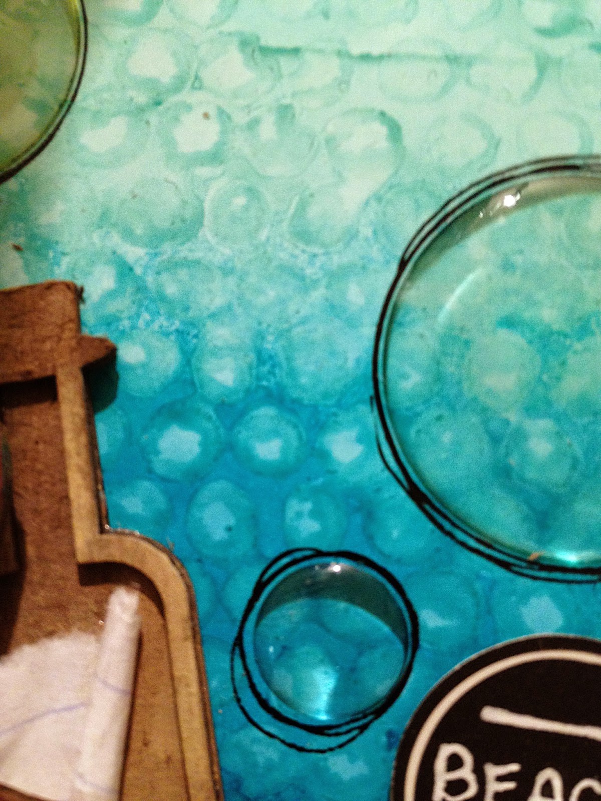
The final look- layered together chipboard, added a beach sign, rub ons, epoxy bubbles that i doddled around, finally a metal labelled attached with rolled washi tape onto screw like hinges.  OOPS i missed that i added patina stickles onto the bottom of tag and spread around to add glitter bling.


 the close ups!


Saturday, 2 August 2014

A Camping we will go, a camping we will go....

My family and i are off camping for a week, with no internet/cell service!!!  That's what you call camping old school- we even pack a generator since there is no power at our site.  There are three challenges i want to get in on so I will be busy when i get back, but i will also be stocked with a bunch of camping photos and hopefully so inspiration.  SEE yOU in A wEEK!