home

Friday, 27 September 2019

Badlands

Have you every been to the badlands?  If not it is a must visit, I find rock truely beautiful and was the inspiration for this layout.  The colors and rust for 13 arts Challenge worked perfectly.


The whole background pages have the badlands drawn, most get covered but you get the idea.


Created new chipboard of broke down and abandoned motel and car.  The key to making them look real is adding some rust color paint, sand and ink.


This is also a new designs- tow truck and gas island.  For the tow truck I added patina and stormy blue paint also with rust paint.  The pieces of this also are designed to not fit tightly together so it looks more like a clunker.


This is my favorite part of the layout- the number blocks!


Vacancy- 3.25"x4" $2.50


Tow Truck 7.25"x3.5" $9.95


Abandoned 4.75"x2" $3.95


Number Blocks
0.5" to 2" $8.95


Gas Island 2.5"x6.5" $4.50

Sunday, 15 September 2019

Country Christmas Cards

So I rarely scrap Christmas (I don't like Christmas Colors) and I rarely (ie never) make cards but i got inspired by Prima's Country Christmas Paper and Alberta countryside.  Here is a set of 8 all which feature farm lifestyle chipboard designed by myself.  Some of the pieces are layered (trucks) to achieve details and dimension.  Enjoy!  Check out The 12 Months of Christmas Link Up challenge.

Classic red hip roof barn.


1956 ford (yes exactly a 1956 ford designed for my husband)


This one is Chev designed for me I love a Chevy but am not as picky about year.


Ironic Alberta Wheat Pool Elevators


Grainers in the field


Mailboxed lined up on the side of a gravel road


I believe this one is another Ford, if a person wanted you could add a small wreath and hang on the hood.


John Deere 60 designed for my dad, the tractor he owed before we moved off the farm.


I start by painting the layers of design, the color is dictated by the section of truck.  I used distress paint I like the colors and it is a thin paint that is opaque and covers completely.


Once paint is completely dry (I like to dry overnight) I sand then ink with distress ink.  The ink settles into the sand portion, highlights the edges and make it look old and worn.


Start to glue layers together.  The pieces are all designed to fit tightly together and show off body lines of vehicle.

Top layer, now the details and body lines are noticable it looks like a complete truck and more realistic.


Here is the complete set of Country Christmas chipboard available on my etsy store BoozyBear

Country Christmas Chipboard $19.95

Merry Christmas All!


Wednesday, 4 September 2019

More Camping Inspirations

another camping layout this week, using Lindy's Sprays and magicals, distress paint, gold embossing powder and 7 dots Studio paper.  And of course Boozybear chipboard and stencils.

I created the background with Lindy's autumn Maple Crimson, Ponderosa Pine Olive, and Antique Bronze.  I was trying to pull the colors from the lilipads in the photos.


The flourish was made with a stencil and gold embossing powder, I wanted the fancy flourish to contrast with rustic wetland chipboard.


 Added some yellow micro beads and green distress embossing powder  around pier posts, give it that mossy abandoned feel.


Outline around circle paper embellishment with black charcoal to add some depth.

Happy scrapping
g

Monday, 19 August 2019

Outdoors

Fall is already in the air, at least here in Cold Lake Alberta. Summer has gone by quick as usual with not enough weekends and in two more weeks Alex will be returning to school.  We got some camping, fishing, gardening, plus a two week trip to Scotland so it was definely a full summer.  I wanted to scrapbook the camping pics from last week so I designed some new chipboard and stencils to work with.
This month at Mixed Media Warriors the challenge is Heart in Bloom, here is the mood board


I started with this pic of Alex enjoying the water.


Started with creating some tags. cut, distress and ink next paint with clear gesso.  Spray with a little water, then splatter with some Lindy'sJazzy Jivin Puruple starburst spray.  Spray with a little more water to blur and spread.


I used the same technique for the background using, Sandra Dee Sepia, Van Dyke Sepia, and Jazzy Jivin Purple.  The key to getting a nice marbling effect is to apply clear gesso first, the gesso prevent the spray from soaking into the paper before you manipulate.

I made this stencil that consists of leaves, bulbs and grass.  Using Alchemy paints- gold rush, crocus fields, romance pink, green olive I applied with a makeup sponge.


So until I added the doodle around and stems they just looked like blobs.  But with the doodling- BING wetland beauty.


Here's the finished floral arrangement.  LOVE IT.


Finished with chipboard pieces painted with Distress paint- scattered strawm Citrus, walnut stain, wild honey, crushed olive, forest moss, and dusty concord.


Enjoy!

Sunday, 16 June 2019

Midnight in the Garden

Long, long time.  Life has been really busy and I have been focusing on painting here are my latest two.
One of the old trucks at the end of our grass runway.


This is a portrait of my father in law Jake.


This month at Frilly and Funkie the monthly challenge is Embellishments, Trinkets and Trim.

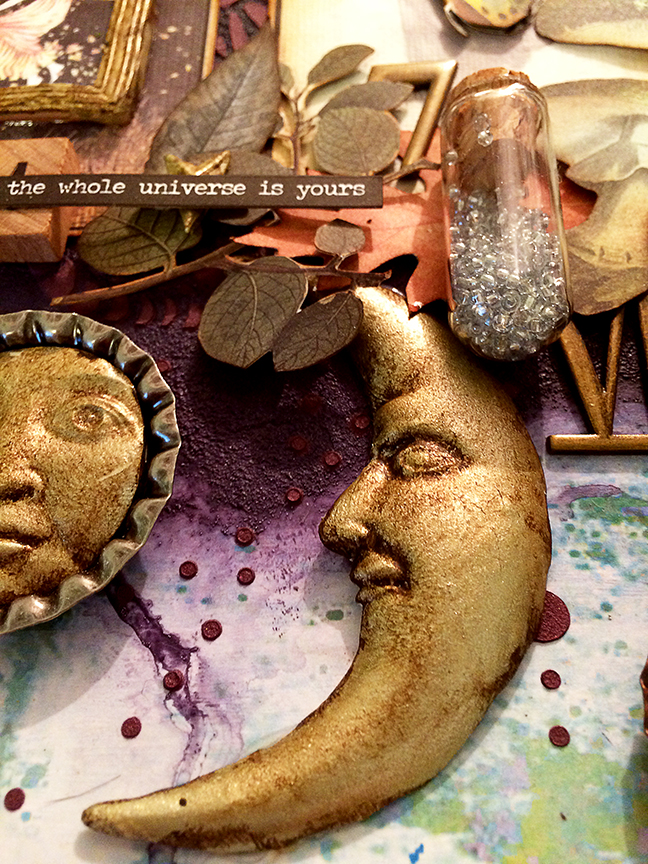
This mixed media collage layout was created with tinted texture paste, alchemy paint and modeling paste, Aga Baraniak embellishment sheet, Treasure Memories (Edmonton) post page, Boozybear Stencil, clay embellishments using Finnabair molds and various embellishments.


I started with half a sheet of pattern paper on the bottom half then used Finnabair art basics dabbing brush (these are fantastic) and two shades of texture paste- midnight blue and mauve purple.  Paint like it is night time sky.


Mix light modeling paste and grape preserves art alchemy paint and apply through stencil created by me.


Finally lots of fuzzy cutting, I love the mushrooms on Aga Baraniak element page.  Ink edges of all paper elements with vintage photo and ground espresso distress ink.


The moon molds were painted with alchemy unicorn paint, and antiqued with raw umber acrylic paint.  I also used lots of pop dots to get depth.


Added beads into a vial and glued stopper in.


Added trinkets in and around layout clusters.


Wednesday, 13 March 2019

Architecture 202

Page two of my Architectural layout.
I don't like this one as much as page 1, but it will do.  I am obsessing with architecture lately, I find old/ vintage windows, door, railing pictures and turn them into chipboard elements.  I love the detail in old architecture.


The window is the focal point, basically because its big lol.  These windows I have been making need to be big since they have lots of little details, if i make them too small the chipboard is cut too thin and falls apart.  The designs have several pieces that are all layered together to get a final detailed piece.


Bottom layer, painted white and sanded.  I inked with distress oxide peacock and ground espresso.  The white acrylic paint works like resist and the ink wipes off but settles into the sanded portion.  The ink needs to be watered base for this technique to work.


Next layer, painted white and sanded inked with ground espresso.


Final layer, painted white, sanded and inked.  I should have inked this layer darker so it is more noticeable.


From the side, all the window layers are visible here.  Making these windows hurt my brain, making sure everything sits together perfectly requires a lot close up work staring at a computer screen.


Some ornate frames recreated with polymer clay, and a mould.  The creases and details of frame collect paint in them- which I like.

Fun tags, because tags are always fun.  The small script on the background is actually washi tape, 2" wide washi tape.  I wish i had brought more.


Then some random frames, if i had added photos I would put a photo in here.

Working on columns next hopefully i will get some time to make into something.


Boozybear Chipboard has been in action with Pam Bray- A Girl with Flair check out these posts.

Pam designed this for Authentique Paper as a design team member, check out the post here.


Here is the chipboard at work for Pam's card for Xyron  check out the post here